ShipUI's Sixth Theme: SOLAR // STUDIO
The sixth ShipUI theme is out. If RETRO is loud, ALOHA is warm, GLASS is soft, NOIR is sharp, and LAB is precise. SOLAR is bold.
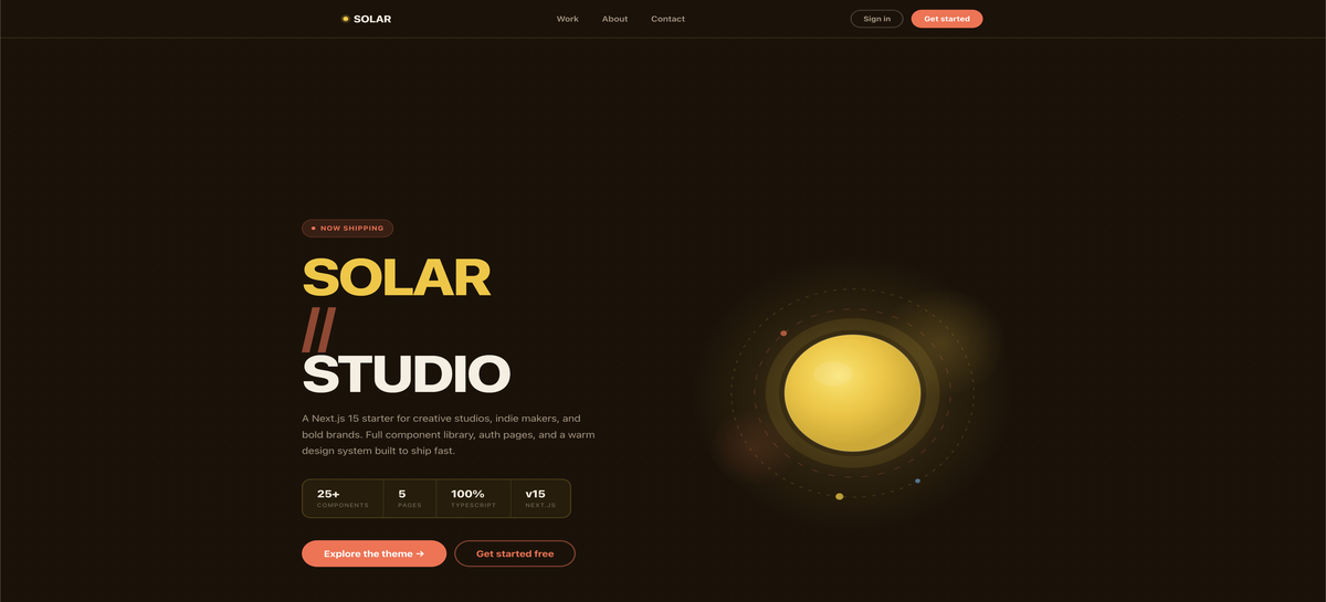
SOLAR // STUDIO is built for creative studios, indie makers, and brands that want to stand out. Deep amber backgrounds, golden yellow as the primary accent, coral for CTAs, and Plus Jakarta Sans at heavy weight for the headings. It's warm and direct without being casual.
What's Included
A complete design system built around the solar palette. Everything is wired up and ready to customize.
Components:
- Buttons in pill shape (primary coral, secondary outline, ghost)
- Cards with colored icon blobs and tag variants in yellow, coral, and sky
- Badges in three color variants: yellow, coral, sky
- Text component with body, caption, label, and code variants
Page sections:
- Two-column hero with animated sun SVG (CSS keyframe animations, no client JS)
- Features grid
- About section with orbital SVG illustration
- Newsletter CTA with yellow background
Layout and auth:
- Header with mobile drawer
- Footer with four-column grid
- Login page
- Sign up page
- 404 and error boundary pages
Tech stack:
- Next.js 15 with App Router
- React 19
- TypeScript 5 strict mode
- Tailwind v4
No broken imports. No manual wiring. Install dependencies and it works.
Works with ShipKit
SOLAR // STUDIO pairs with ShipKit if you use it. If you're wondering why ShipKit exists, Why We Built ShipKit explains the problem it solves.
The bundle adds ShipKit AI conventions for $10 on top of the base theme: cursor rules, project structure docs, and a CLAUDE.md ready to go.
The theme also works standalone. No ShipKit dependency, no lock-in.
Pricing
$29 for the theme. $39 for the theme with ShipKit conventions. One-time purchase, instant download, permanent link.
No subscriptions.
What's Next
More themes are in progress. The goal is the same across all of them: a real design system, a modern stack, and nothing left for you to wire up yourself.